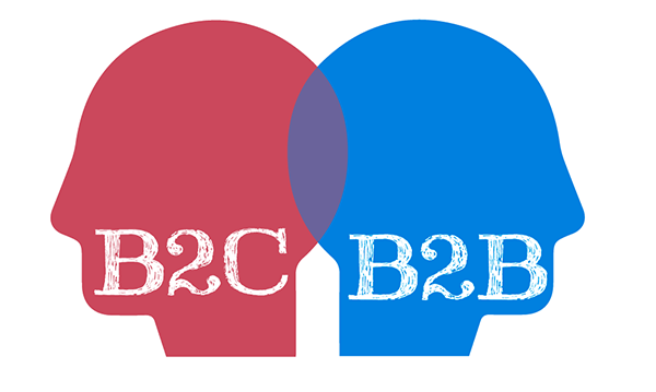
B2B and B2C visitors are different people. In B2B, this is a person who thinks for an entire company ...

Printed 2011-06-20

In RuNet, there are many sites that do their job poorly for only one reason: the designer, creating the visual appearance of this site, did not realize for whom the site is for an individual client or for the whole business. What are the differences?
First, you need to understand that visitors in these two cases are different people. In b2b, this is a person who thinks for the whole company. He solves his personal interests, but first of all he solves the tasks of the entire organization as a whole.
In the case of b2c, you usually need to sell something to a person who thinks only of himself and is not a specialist. This means that the style of communication between the site and the person should be simpler, with emphasis on emotional techniques. The client will rarely begin to thoroughly understand the product - there are such people, but there are few of them.
The b2b site should communicate with the visitor differently because it is most likely a person of a different social level: either the owner of the business, or head of the procurement department, or something like that. He is much more versed in what he needs than a b2c client. He has been boiling in this business for several years and does not need any list of advantages such as "we are a young, dynamically developing company ...". He needs a case.
In website design for b2b needs more emphasis on image than in b2c. The buyer of the phone in the online store looks at the image a little: he looks more at the price, convenience of ordering and so on. But the business client wants to make sure that the company that owns the site is serious. And this should be reflected in the style of the site: more minimalism, less pretentiousness.
If you are making a b2b site, you need to understand that the conversion mechanisms will be different. Yes, it is convenient to buy a mobile phone by putting the goods in the “basket” on the site. But the company will not order spare parts for the elevator! And if it does, then after a call and discussion.
On the site for a retail client, you can describe the advantages of the company thesis, in four blocks with beautiful icons. But this doesn't work in b2b - you need real facts that will convince a businessman or middle / senior manager that the site tells the truth about the company.
For example, to take advantage of some very specific and detailed points that show the expertise of the company owner of the site. They will be understood only by experts - but a site has been created for them.
Or, if we are talking about “Reviews” on the site: in b2c they can be wonderful done in the well-known format “Photo + Name + Link to social network” or something like that. If you do so in b2b, it will only get worse! It's better to show letters of recommendation with signatures and seals (although they are often faked), an interview with the head of a well-known company in the industry, a story about what was done in collaboration.
In b2b, stereotypical, commonplace solutions and cliches. It is necessary to convince the decision maker of their competence. You can't count on “a fool”: the client thinks harder, and the issue price is different, and the level of responsibility.
The retail client can be encouraged to make a quick purchase. In b2b, it's better to rely on the visitor to remember the site (by the way about the image!), Leave contacts, contact in the future, carefully consider and weigh everything.
Here, as in the article on styles and graphic rhyme, you need to make a note: in most cases, the cost of website design does not affect the complexity of implementing any of the techniques described in the article. It all depends on the desire of the designer and his ability to understand what site his customer needs.
More articles in the section "Miscellaneous":
Graphic rhyme
Design differences for b2b from b2c
Landing design in 77 minutes
Responsive website design in 2 hours
A selection of lessons on Photoshop

